With the turn from 2022 to 2023, many interior designers wait in anticipation for word from Pantone. Pantone’s Color of the Year is always a hot topic, and 2023’s capitalizes on that buzz with its vividity. The Color of the Year is Viva Magenta 18-1750, a startling, in-your-face pink that punches through the multiverse not unlike the hit Marvel character Scarlet Witch. HomeThangs is here to help you through the “magentaverse” defining and decorating with this intense shade of pink.
What Is It?

Pantone describes the color as a “powerful,” “optimistic,” and “fearless” color “rooted in nature.” It really is a celebration of how far technology and society has come. We couldn’t have had Viva Magenta as a color for the masses, let alone color of the year, until the modern age. While nature has this rich pink in abundance, it’s been difficult to translate to our homes because flower petals never dye with their full color. If you’ve ever admired the depth of color in a sliced beet, this color is for you; vibrant and almost sparkling during the day, it has dark undertones that can close down a room in the evening as sunlight starts to fade.
Use It Sparingly

Pantone’s color of the year picks tend to be hues that have a big impact, and aren’t necessarily ones that would immediately spring to mind if you were building an interior palette on your own. Keep in mind that Pantone doesn’t just do paint – their choice of Viva Magenta is has a big influence on fashion and makeup, too. It’s not a bad idea to approach the color the way you would with fashion: dressing head-to-toe in magenta is certainly a look, but it’ll have a more subtle impact if used sparingly. Consider Viva Magenta as an accent: like a clutch or a good lipstick. Similarly, floor to ceiling magenta is almost guaranteed to overwhelm, but one or two pieces can add some killer vivacious energy to your space.
…Unless You Have a Cool Teenager

Let’s be honest: as we get older, our tastes in interior design tend to get… safer. But magenta has long been a staple for boldest interior decorators out there: teenagers. While you might be muddling over how to put a sophisticated twist on this flaming hot pink, teens know to go big or go home. While it’s not pink toe-to-tip, this bedroom has huge impact, from the matching accent wall and valise to the almost dizzying contrast against the teal headboard. The look is fun and unfettered – if a little overwhelming to a adult’s sensibilities. While you may err on less magenta in the room to avoid looking childish, Viva Magenta is perfect for a joint project with your kid to overhaul and personalize their bedroom. Done right, it’s a look that should last them well into college.
…Or You Were A Cool Teen

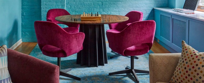
We all have to grow up, but doesn’t mean you need to leave your preferences behind. And if you never forgot your neon color phase, it’s a great time to dive back in. If you invert the amount of Viva Magenta with the bright blue it’s paired with from your old bedroom, you can create a very modern look for more public rooms like your dining area. Painting over wall texture (like brick or molding) with floor-to-ceiling blue, teal, or green has been a trendy way to put a modern twist on older architecture. Contrasting it with a quick jab of hot pink intensifies the chic, contemporary feel and will give your space a daring, designer flair. You’ll note, that this room relies heavily on solid colors, which is important. With such a high contrast in play, patterns are bound to tip your decor from daring into just plain dizzying.


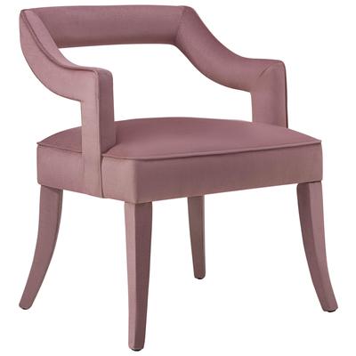

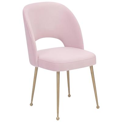
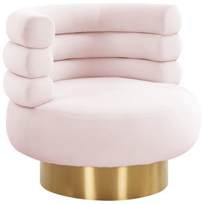

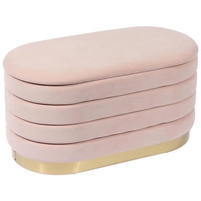
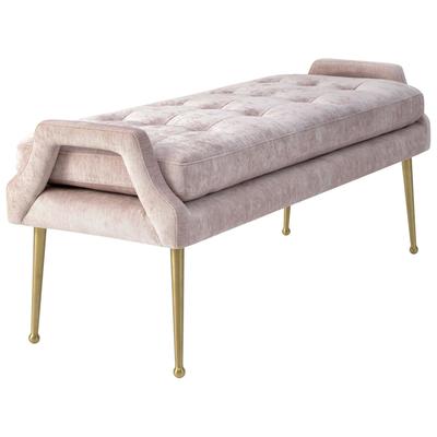
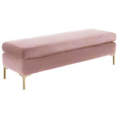
A Tasteful Splash

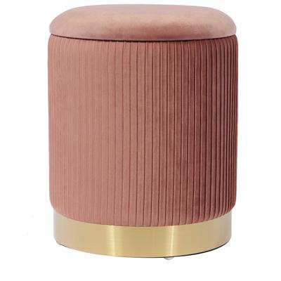
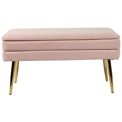
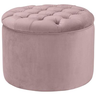
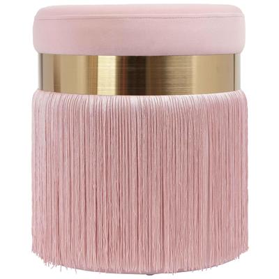
Not feeling the looks that are avant-garde and overwhelming? Don’t cross Viva Magenta off your list just yet. A little bit of the color goes a long way, and has a big, big impact. If there’s a part of your decor you want to catch peoples’ eye (or an area you’d like to distract from), a little pop of hot pink will do the trick. Even something as simple as a flower vase (flowers optional) will add a little pizazz to a room. Bigger pieces will have a bigger impact (from throw pillows to area rugs to accent furniture), but personally I like the element of surprise – when you find a little drop of color in an unexpected spot.
A Perfect Pairing

For anything more than the most minimal amount of magenta, there are a few ways you can fit the color into a palette. First, is to use it as the thread to tie together an otherwise neutral room. For that, you’ll want to scatter matching pink accents throughout the room, letting the pops of color lead the eye through your space. Alternatively, Viva Magenta works surprisingly well with a darker, earthier palette. Think rich, chocolatey brown wood and leather contrasted against creamy white and blush, accentuated with vivid pops of intense pink. It’s an unconventional mix of modern and traditional, to be sure. However, it’s that little touch of the unexpected that really makes Viva Magenta shine.
Viva Magenta is a bold, intense color – one you might be wary to try as a lipstick, let alone to paint your walls. But this is one color trend that rewards creativity, bringing a lively touch to any room you dare to try it out! That said, if you were hoping for a color of year less intense, Sherwin-Williams has you covered with a more subtle pink.