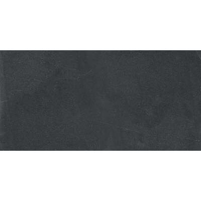
As we really roll into the new year, every big paint company releases their trendy color of the year, and 2023 is no different. For Sherwin-Williams, this year’s big color is Redend Point (SW 9081) a creamy, rose-tinted brown. A more saturated blend of two colors that have been popular in recent years – beige and blush – Redend Point is a warm, earthy neutral poised as an alternative to the grays and greiges that have dominated interior palettes for years.
What Is It?

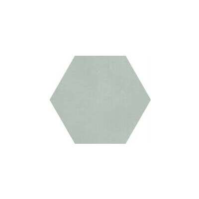
Sherwin-Williams describes Redend Point as a warm, soulful neutral that inspires connection and a feeling of cozy comfort. I’ve heard other reviewers label it as beige, terracotta, mauve, and even orange. Personally, I would compare the color to a rich clay that hasn’t been heated in the kiln yet. Or perhaps, if rose gold was matte instead of metallic. Not all of us have excellent color vision, which these “Color of the Year” picks are chosen using. If you have a hard time telling your teals from your greens and blues – but want to be trendy – don’t fret. Treat Redend Point as a warm brown or even a dark pink.
What Colors Should I Pair It With?

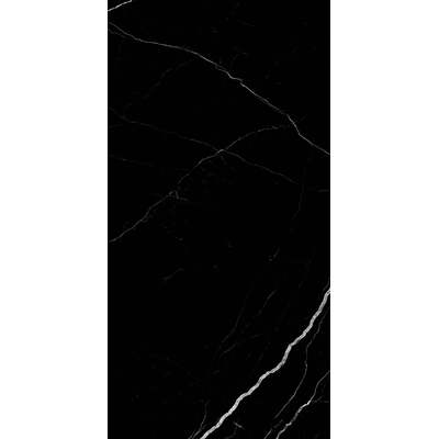
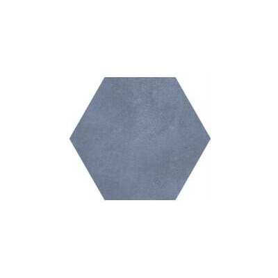
Sherwin-Wiliams suggests accenting Redend Point with other nature colors, like a dark mossy green, salmon pink, or deep wine red. But the saturation level of the color makes it a little tricky to work with; Sherwin-Williams’ default palettes skew quite dark, and Redend Point is a tone that needs brightness and contrast to really thrive. Pairing it with a near-white and a dark color (like a Charleston Green) will bring out the warmth and richness of the color. Avoid too many middling-neutrals and grays. They will make this lovely cut clay color feel muddy and muddled, more like wet cement.

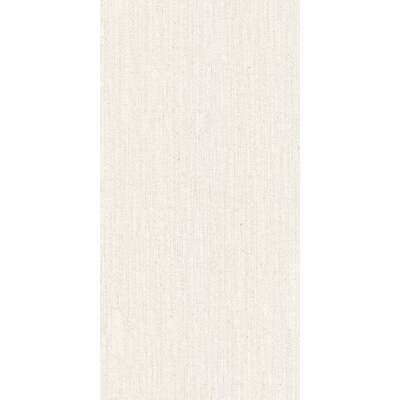
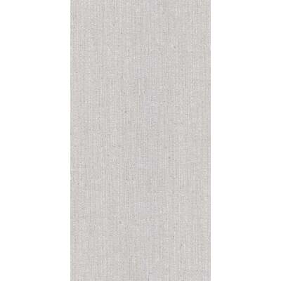
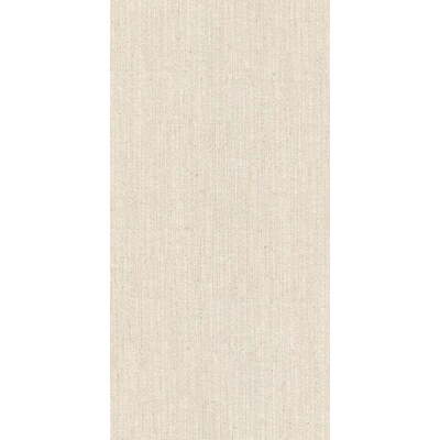
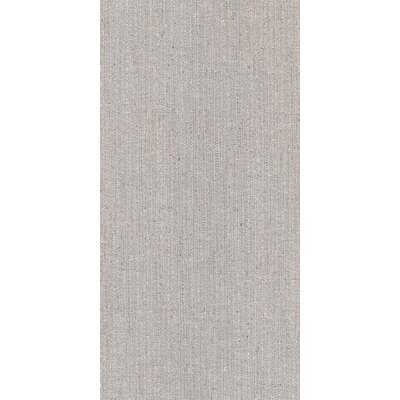
Lighter-tinted blushes and beiges serve well as pastels. But while the goal of Redend point is similar – to be gentle, calming, and quiet – it’s a touch too saturated to have the lightening, brightening effect you want from a pastel. On the flip side, used as a tentative warm brown, it will harmonize with other warm colors (e.g. red, yellow) and contrast against cool ones (e.g. blue, purple). If you’re building a room from nothing, I’d suggest pairing with other browns and warm metal accents, letting the metallic finish be the eye-catching point of the space. For an earthier feel, try pairing it with natural linens (like jute, hemp, or sisal). Either way, take care to include a light, pure tint to ensure the color doesn’t overwhelm.
Shop Contemporary Sconces:
Using Redend Point Creatively

For a lot of interior decorators, this color swatch a bit boring – if not outright yawn-inducing – to work with. It’s hard to pitch any shade of pink to a masculine audience, and we’ve walked the entire spectrum of browns and back again in trends. But I think this combination of a “safe” or “basic” overtone (brown) and a “risky” undertone (pink) can be an exciting challenge. And there’s certainly a demand for an alternative to all-gray color schemes – a niche that Redend Point is at least aiming to fill. The real potential in the color lies in how changeable it is; it’s particularly influenced by ambient light and shadow, and will look quite different depending on the colors next to it in your decor – which can be fun to play with.
Consider Your Furniture Finish

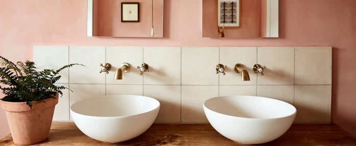
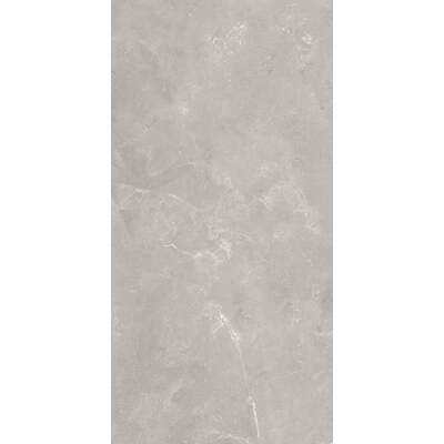
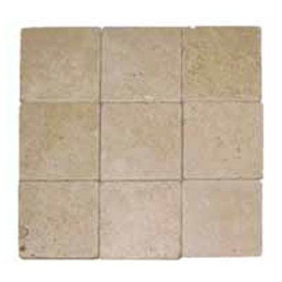
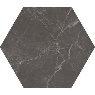
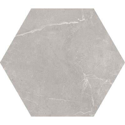
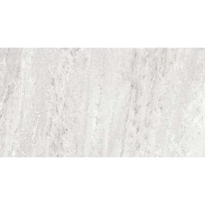
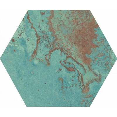
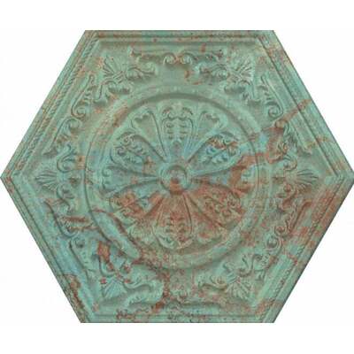
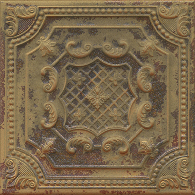
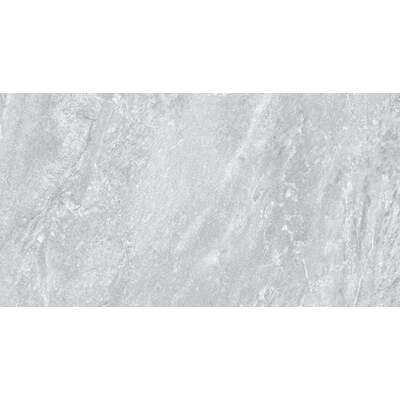
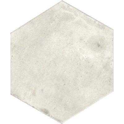
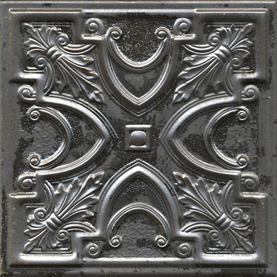
If the color looks a little overwhelming on Sherwin Williams’ landing page, keep in mind that colors never translate perfectly. Whether it’s from swatch to wall or other materials like wallpaper, fabric, furniture, or flooring, there will be a good degree of color variation. Personally? I think it has the most interesting layers as a metallic finish or a ceramic tile. While it’s beautiful to get that creamy tone in wood, it’s difficult to match with other wooden pieces; linens typically err either more pink or more brown, rather than perfectly matching the exact color. Polished pinkish metals like rose gold or copper have the built-in shine and pizazz that the color lacks on its own. Also, ceramic pieces add much-needed gradient and texture while still being quite close to the base color.
Best Rooms In the House

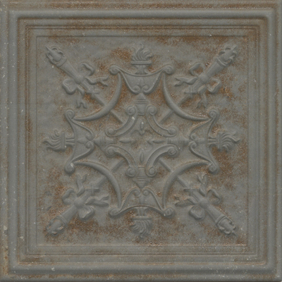
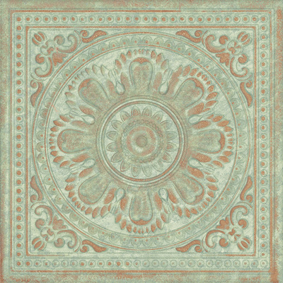
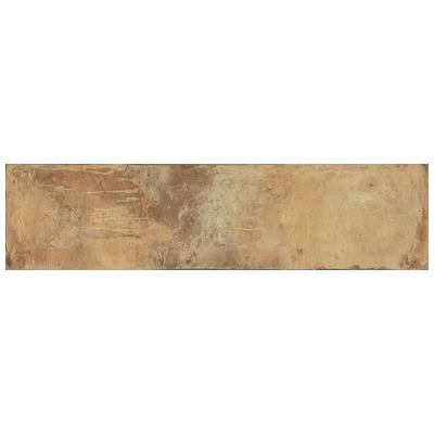
So, now you know how to work with the color, but the question remains: where to put it. Unless you’re aiming for an earthy, terracotta-like Mediterranean/Southwestern-adobe vibe, I wouldn’t use Redend Point on more than one interior wall. It’s rich enough to easily overwhelm a space, especially if you’re worried about a room being too dark. That said, it’s a surprisingly good option for outdoor spaces. Think of your patio, outdoor kitchen, or even for use as your home’s exterior paint. Granted, it’s a smidge California-McMansion when applied generously. Redend Point is at its best in direct sunlight and paired with earthy elements. If your home has even a hint of Spanish, Italian, or Moroccan architecture, go for it! Its villa-like elements (terracotta roof tile, stone, ornate lighting fixtures, etc.) will make the color feel nicely regal.
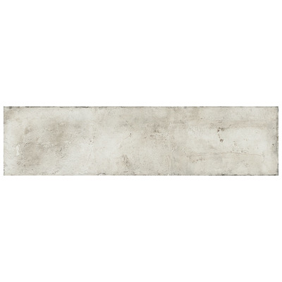
Shop Terracotta and Brick-Look Tile:


But Don’t Layer on the Paint

Otherwise? Skip the paint (Sorry, Sherwin-Williams) unless you plan to add a popcorn or distressed effect to your walls. Redend Point is a much more versatile color when it has some texture or patterning to it. Clay pink tile, Southwestern plaster, textured fabric or linens, patterned wallpaper, or other decor elements help lighten up and balance out the color, keeping it from feeling monolithic. If you enjoy Bo-Ho style nurseries, it’s a nice addition to the sepia wicker and pine-green palette typically associated with the look.
Remember, the purpose of Redend Point is to create a calming, earthy feel. You’ll get the most mileage out of it by treating it like a pinkish adobe. It’s something that can feel quite cave-like when all around and closed up, if you’re into that. Or, you can it be breezy and soothing with big open windows, filmy natural textiles, rustic wood, and ornate metal accents. If you want a less bombastic color of the year for 2023 than other companies’ choices like Pantone, consider Sherwin-Williams’ Redend Point to add to your home. And if this color isn’t your style, remember that it’s only a year until we’re given something entirely new!
Shop Natural Fiber Area Rugs: