Pantone’s color of the year picks are always a little symbolic. Usually, it’s a color that feels significant – one that will influence the design and fashion industries, and often has subtle political undercurrents. But it’s also always at least one part attempt at a mood ring for the population of the planet. Pantone leans into this last bit pretty hard with their picks for 2021. Not only do they break with tradition by choosing two colors (Ultimate Gray and Illuminating), but they’re make it clear that these choices mark a hope for stability and positivity in the new year. This might feel more like sentiment than design sense. But as someone who can get behind a little bit of feel-good decorating, I think there might be something to these choices. Besides, you miss every shot you don’t take, right? So, here we go: gray and yellow.
Ultimate Gray: Reviving And Rethinking Everyone’s New Favorite Neutral

Speaking purely from an interior design standpoint, Ultimate Gray is a pretty solid choice for Pantone’s color of the year, if a little bland to stand entirely on its own. After a big surge in popularity from 2015 all the way through 2019, it looked like gray was going to drift back into obscurity as quickly as it appeared. But while designers have stopped taking a gray paint roller to every available surface, it’s stayed a solid choice for a more modern neutral. Ultimate Gray has all the qualities that make gray in general a reliable choice: it’s a light-toned neutral that pairs well with just about anything, whether it’s other warm or cool toned colors, or even different shades of gray.
Skip The Cabinets, Buy The Sofa

That makes it a perfect choice for big-ticket furniture purchases. With a few prominent pieces in Ultimate Gray, you’ll be able to repaint, re-accessorize, and even entirely re-decorate without having to replace your most expensive furnishings. On the other hand, this same quality makes it kind of a blah choice for walls and cabinetry (especially with no contrasting cabinets or hardware). I suspect most of the gray fatigue came from overdoing these large surfaces with uninterrupted dark or cool-toned grays. Avoid this problem by sticking to a lighter gray, using it on medium-sized surfaces, and make sure it’s acting as a backdrop for a more interesting color.
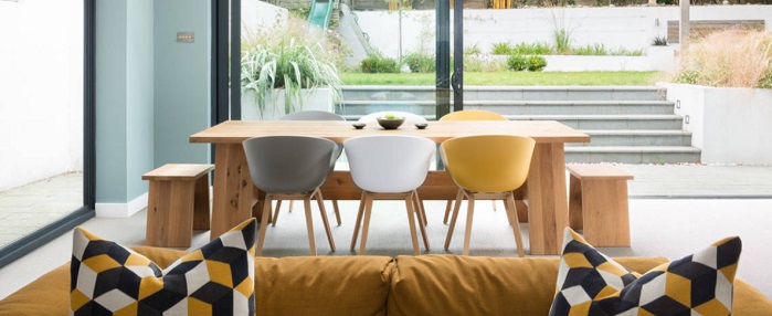
Illuminating Your Décor With A Little Drop of Yellow

This is where I think the dual-color pick is a smart one; yellow can be a very interesting accent color if you use it well. But here’s the thing about decorating with yellow: more than almost any color, a little bit goes a long, long way. Last year’s Classic Blue is about as close to a primary color as this year’s Illuminating, but it was much better at blending in with the crowd. Speaking as someone who adores the color yellow, it’s very easy to accidentally tip from a cheery pop of color into… well, a room that belongs to someone who really, really likes yellow. So how do you squeeze all the mood-improving benefits out of the color without turning your home into something garish? Use it in very small doses, against a… you’ve got it, a neutral-toned backdrop.
The Brighter The Yellow, The Less You Need

I’ll admit, it can be a difficult balance to strike. It’s certainly one of the ones that if it goes wrong, you know it when you see it. But one of the benefits of pairing gray and yellow is that even a small amount of yellow can eat up some of the washed-out, chilly, grayscale feel of entirely gray interiors. Something as simple as plunking down a bouquet of yellow flowers will breathe life into a room that feels too much like a black and white photo. Adding a few more yellow accents (sparingly!) will help direct the eye through your room and can make your space feel more visually engaging. If you already have a lot of gray in your home’s color scheme, a new yellow throw pillow might be all you need to perk up your space (and let you declare your décor on trend for 2021!).
Blend Pale Yellow, Gray, And Other Neutrals For A Soft, Warm Look

Now, it’s worth noting that Illuminating specifically is an interesting choice for Pantone’s color of the year. Primary yellows have long been a popular accent in modern homes; rich mustard yellows are definitely making a comeback with other midcentury-influenced upholstery colors. But Illuminating is closer to a pastel yellow than either of these more robust shades. This makes it an easy win in a nursery. But I think it has a practical reasoning elsewhere in the home as well. While a teaspoon of a bold yellow can overpower a space, softer yellows are easier to fade out and blend in – with other neutrals like cream or tan, warm-toned wood, or even warm metal accents like gold or brass that are so popular right now.
Add Contrast For A More Contemporary Style

The flip side is that while primary yellows stand out well on their own, lighter tints are easily muddied. This is especially true when they’re used directly against or in patterns with a light gray. That can be a good thing – if you want a space with a hazy, sunshiny feel propped up with warm neutrals. But if your gray-and-yellow pairing looks a little bland and blah rather than cozy and inviting, the colors probably need a buffer between them. To keep everything looking clean and sharp, don’t shy away from using black, white, or wood elements to help keep the colors distinct from each other. Since both colors are quite muted, good contrast is the key to making the paring feel stylish and intentional in a contemporary space.
Pantone’s Color of the Year 2021: A Challenging But Rewarding Duo

Gray and yellow can be an incredibly beautiful pairing, and Ultimate Gray and Illuminating are solid picks that look natural and appealing side by side. But they can be a difficult combination to decorate with, and require thought and care to pull off. Too much yellow can make a space look childish or garish; too much gray can make a space feel cold and bland. That in turn can make a little bit of yellow stand out in a bad way. The key? For a soft look, blend your colors and incorporate other warm neutrals. For a sharp, clean finish, use solid black or white to keep all your colors crisp and distinct. And if it’s a look you just aren’t feeling? Skip Pantone’s color of the year for 2021 and try a different designer’s color picks.