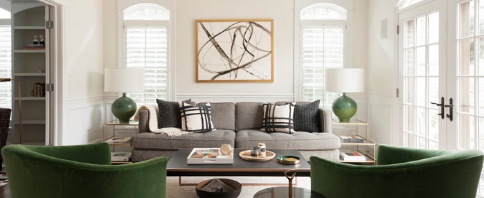
Good symmetry is one of the fundamentals of interior design. There’s something inherently pleasing about a room with a balanced feel to it; it’s an easy way to get a professional look without an advanced designer’s skill set. The flip side is that perfectly symmetrical spaces can often feel like too much of a good thing; cookie-cutter perfection is hard to maintain, and done on too large a scale it can feel heavy handed and amateur. This living room by Hence Interiors is a great example of striking the right balance; the symmetry is almost perfect, but established mostly with accent pieces, which makes the look both subtle and easy to update.

Why It Works
Symmetrical interiors often fall short when the symmetry relies on distinctive big-ticket items – like a matching pair of blue velvet sofas – or when they try to be symmetrical from multiple directions. This sitting room is a pass-through space from left to right, but beautifully balanced from the direction of the photo. That means the space can paint a pretty picture from one angle without feeling samey from every direction. The architecture here lends well to the look; the even-spaced matching windows crave a mirrored layout, while the French doors along the exterior of the room invite you to explore outside.
Get The Look
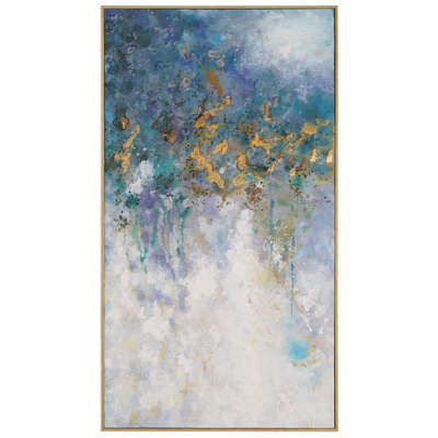
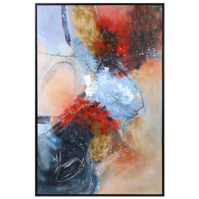
The real key, though? The room has a largely neutral base – a gray sofa, black coffee table, cream walls, and a pale blush rug. That means the symmetrical touch points – the chairs and lamps – stand out boldly (even though they’re small and relatively few), and lend weight to the more subtly matching end tables (and the perfect bisection of the two-cushion couch!). Just as important are the elements that break the symmetry – like the abstract painting, pillows, and slightly offset tray table. This little bit of variation keeps the symmetry from feeling stiff or uncanny; the little “flaws” make the look feel purposeful and maybe a little cheeky rather than fresh out of the box. The best part? Pull the chairs and lamps and you have a striking black, gold, and gray decor…. ready to redecorate. A fun pair for some of the bolder Pantone picks!
The two big mistakes people make when designing a very symmetrical space are: being too heavy handed with their color scheme and making their spaces perfectly mirror matching from every direction. A lighter touch will give you a finish with more finesse; a little asymmetry will keep the look just relaxed enough to live in.
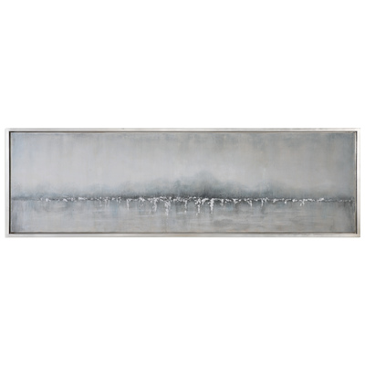
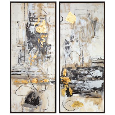
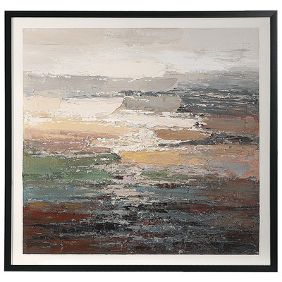
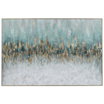
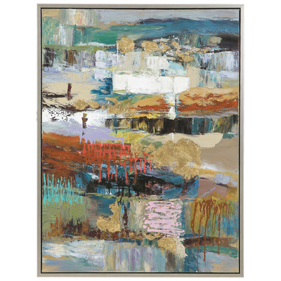
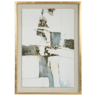
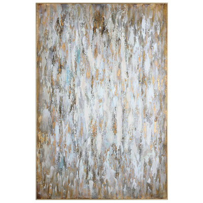
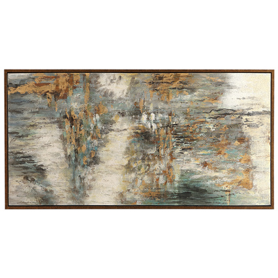
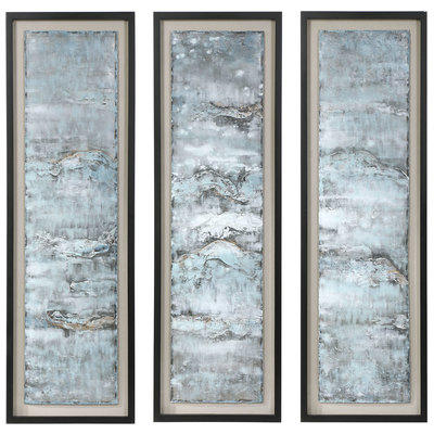
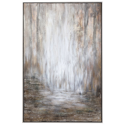
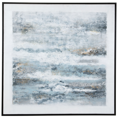
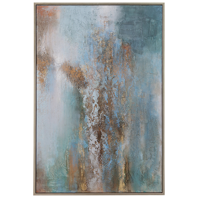
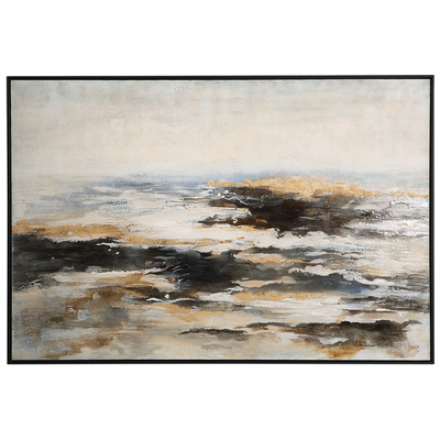
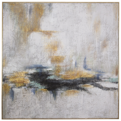
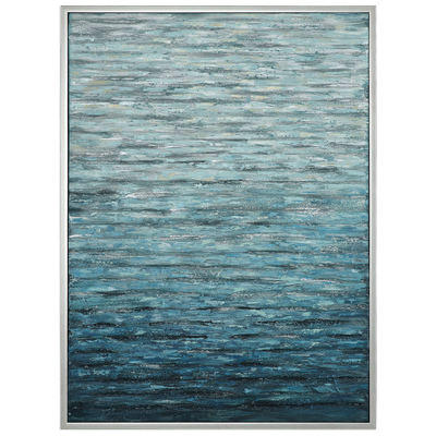
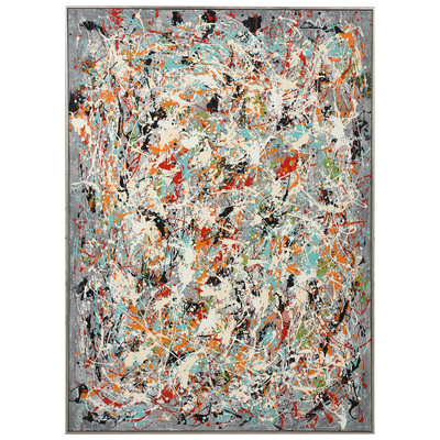
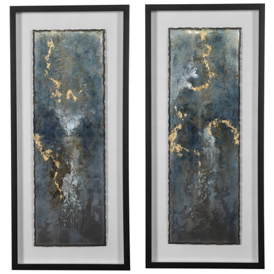
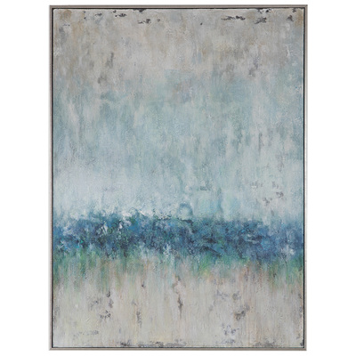
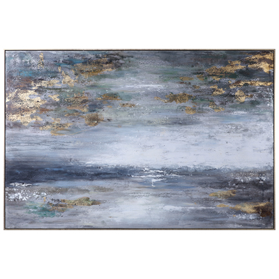
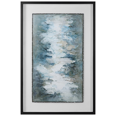
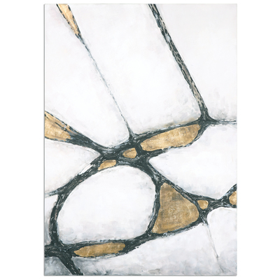
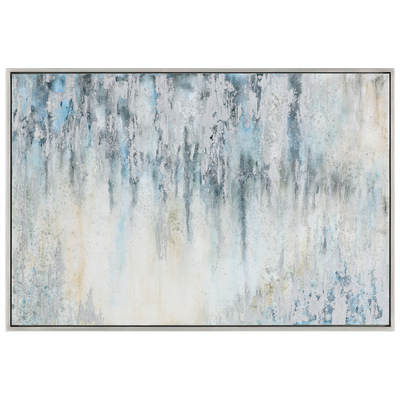
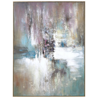
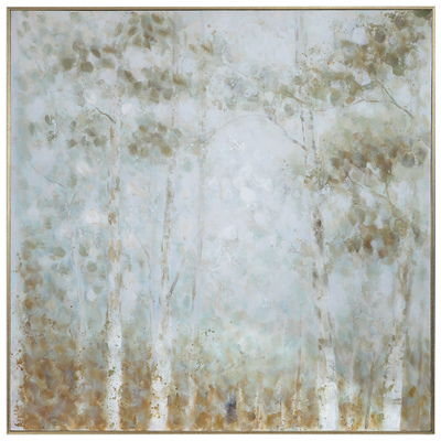
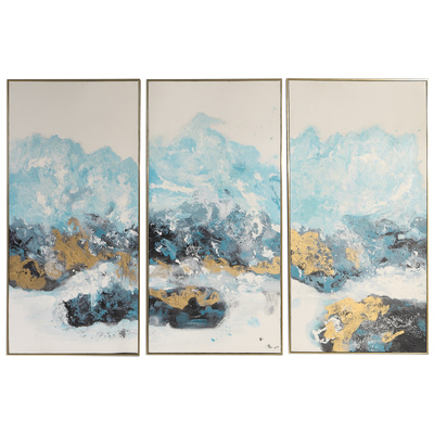
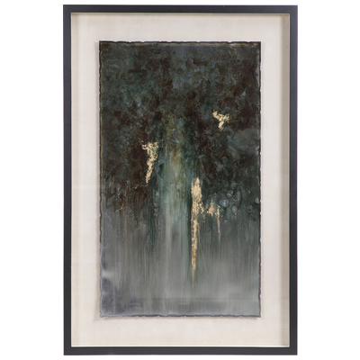
Shop Abstract Paintings: