If you’ve been kicking around any interior decorating blogs or investigating your own home remodel for the next year, you’ve most likely come across headlines featuring the newly announced color of the year for 2017, which has been dubbed ‘greenery’. At first this may seem to be a perplexing concept. Color of the year? According to whom? God? The United Nations? Popular vote? And how can you name the most popular color for a year when that year hasn’t even happened yet? Who has that power?
The answer is, unsurprisingly, a color expert. Pantone is a group that specializes in identifying and streamlining color use and matching across a whole range of artistically inclined industries, including fashion, technology, architecture, graphic design, and interior decorating. Their Color Institute helps companies and corporations decide what colors are best for what they are trying to achieve, and every December they make a projection of what is going to be one of the top colors in the new year, based on an aggregation of upcoming products, current events, and the focus of the fashion world.

2017’s Color of the Year has been declared “greenery”, or as I like to call it in my more plebeian moments: green. According to Pantone, green was chosen to reconnect us with nature and the promise of new beginnings–the beginning of the year, and the anxiously anticipated onset of spring. According to color psychology, this is spot-on. Green has been connected with harmony, restoration, and bounty. We automatically connect it with a fresh start and the natural world. And no matter what your politics may be, I think we can all agree that we are looking forward to that 2017 reset. So I think greenery was a great choice, psychologically speaking.

From a decorating standpoint, however, I was a little more hesitant. Choosing green from a poetical standpoint is all well and good, but as a color to build any sort of decor around makes me automatically leery. I am still haunted by the oppressive ghost of the dingy green refrigerator and stovetop in my father’s apartment. On the other hand, declaring something broad like greenery means that there are so many different shades to choose from and still stay on trend. There are so many different sorts of green–the bright and tropical lime, the deep and elegant emerald, the moody olive. If I ignore my personal fears, greenery gives you a ton of options, honestly.

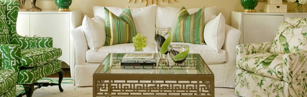
That said, you can definitely overdose on green. I honestly like it best as an accent color, rather than a base. It pairs particularly well with metallics like gold and bronze, and neutrals like beige and white. And if you’re really going for a natural spring vibe, houseplants are great way of getting in your green. I’m also a fan of the popular trend of painting one wall a very deep color and leaving the rest of the walls in a room white or off-white. That way you make a statement with the focal point of a room, but don’t overwhelm the senses with an intense color.

On the flip side, a bright, assertive green can work incredibly well as a single showcase piece rather than a room-wide color scheme constructed from smaller accents. Something like this bold green sofa will be an immediate centerpiece of any room you put it in, and give the space a verdant, lush feel, even if there isn’t a hint of green anywhere else in the room. It’s a bold choice, and one that’s admittedly a little harder to change up as trends shift than a throw pillow, but velvet-upholstered, vintage-style sofas done in gem tones are one of the top designer items this year, which makes this a great way to try out both trends at once.

Remember my childhood trauma of green kitchens? Well, they say that admitting your fears is the first step to overcoming them, and this blog has certainly been a high degree of exposure therapy. Fortunately, there is a respectable and non-terrifying way of applying green in the kitchen, namely when paired with plenty of white and natural light. White tile or marble countertops would balance out the depth of the green, and plenty of light would keep the space from becoming oppressive.
The more and more I think about it, the more and more 2017’s Color of the Year grows on me. Green is fresh, it’s inviting, it stimulates thoughts and hopes for the future, and it is certainly more versatile than 2016’s choice of rose quartz. So I say to the color experts, well done, and to the rest of us, look forward to the new year and going green.